Cut Culture Barbershop
Concept website for a veteran-owned barbershop on Castle Hayne Road.
A concept design I made on my own. Cut Culture Barbershop is not a client.
Overview
Project overview
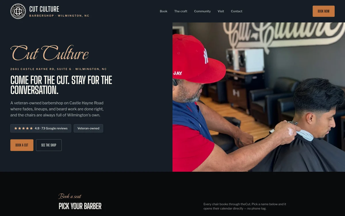
A veteran-owned barbershop in Wilmington with five barbers, each with their own booking calendar. I designed and built this concept site with photos doing most of the work: the shop, the barbers, and booking, with very little copy.
Approach
How I approached it
This is a concept site I made on my own. A barbershop sells the atmosphere and the relationship with your barber as much as the haircut, so the site had to show both before asking for anything. It was also a test of how much the photos could do with very little copy.
The homepage opens on a barber in the middle of a fade, with the shop lettering reflected behind him, under a line the shop already uses: Come for the cut. Stay for the conversation. The address and hours sit right below, because for walk-in customers those are the two things that matter most. The rating and the veteran-owned status are shown as simple badges.
Booking is the center of the site. Each of the five barbers has a separate calendar, so the site links to each barber instead of a general inquiry form: pick a name, see their availability, and book. The design uses deep navy and copper with a script logo over condensed type, which fits a neighborhood shop and keeps the photos as the main focus.
What was delivered
Deliverables
- A photo-led homepage showing the chairs, the cuts, and the shop, with a short headline
- Booking links for each of the five barbers (Jay, Shawn, Cam, Nya, and Dom) that open their own calendar on theCut, so customers don't have to call
- Services named the way the shop names them: fades, lineups, beard work, straight-razor detailing, head shaves, loc maintenance, scissor work, and tapering
- The 4.8-star rating from 73 Google reviews and the veteran-owned status shown as badges at the top of the page
- A visit section with the address and hours a walk-in needs: 2601 Castle Hayne Rd Suite G, Monday to Friday 9 to 6, Saturday 9 to 2, closed Sunday
- One inquiry form with an option for private events and group bookings, so those requests stand out
Key decisions
- A script logo with bold condensed type, which feels like a barbershop without looking retro
- A deep navy background with one copper accent color; the rest of the color comes from the photos
- Booking is the main button on every screen
- A concept I made on my own, with original copy and design