Ninebark Coffee Roasters
Design study for a coffee roaster whose homepage is a flavor map.
A design study. Ninebark Coffee Roasters is a made-up business, so the copy, prices and details are invented to show how the design works.
Overview
Project overview
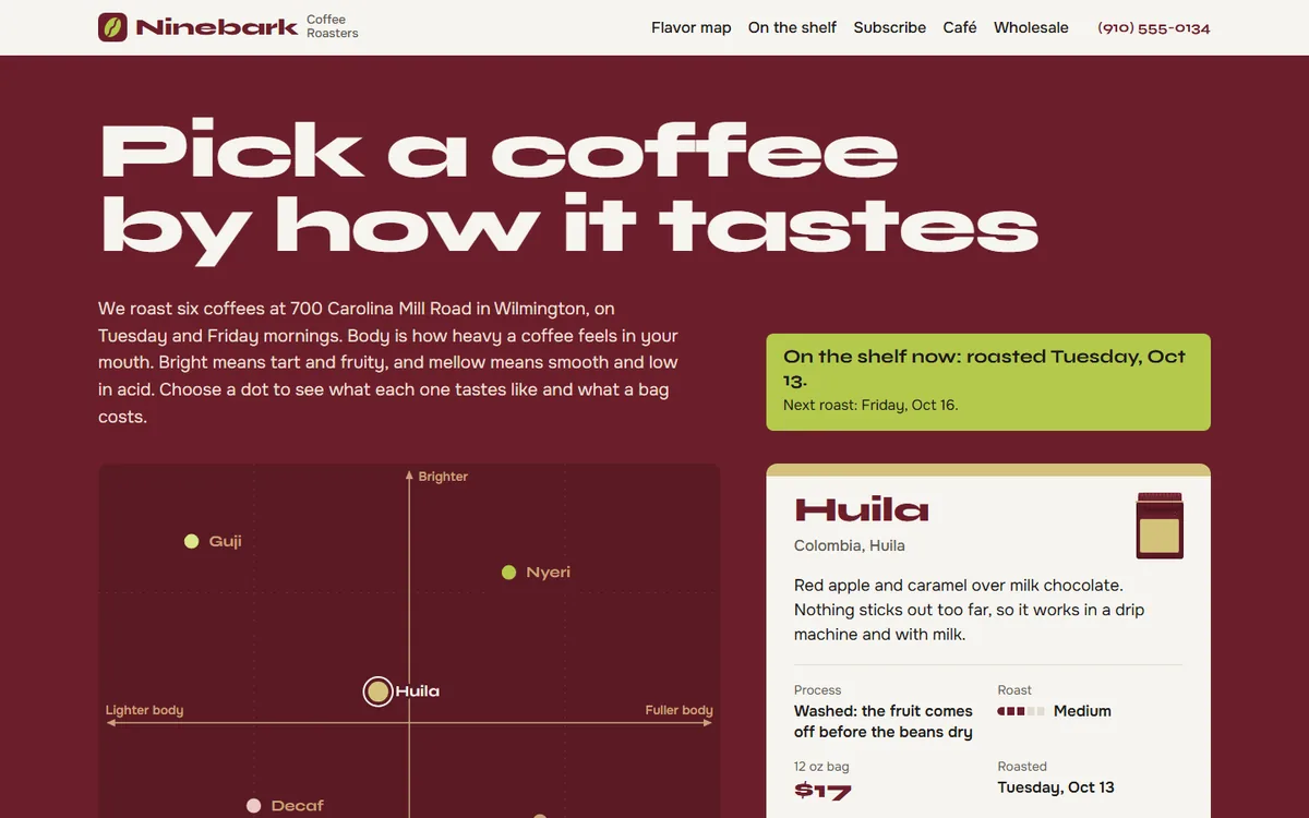
A made-up small-batch roaster with a café in Wilmington. People choose coffee by taste, and they want to know it is fresh, so the homepage plots six coffees on a map from lighter to fuller and brighter to mellower, and every card shows the date that coffee was roasted.
Approach
How I approached it
This is a design study for a coffee roaster I made up. Most roaster websites list their coffees by country, which only helps people who already know what a Kenyan coffee tastes like. I wanted the page to answer the question people ask at the counter: which one will I like? So the homepage is a map. Lighter coffees sit on the left, fuller ones on the right, bright and fruity at the top, smooth and mellow at the bottom. Choose a dot and that coffee’s card opens with plain tasting notes and the price of a bag.
The second thing a coffee buyer wants to know is how fresh it is. Ninebark roasts on Tuesdays and Fridays, so the page works out which roast is on the shelf right now and prints that date on every card and on every bag label. The subscription total uses the same calendar to say when the first box would ship.
The bags are drawn in CSS, which keeps the six coffees consistent and lets each label color do a job. The colors run from lime to tan in the same order the coffees run from bright to mellow, and the dots on the map use the same colors, so a coffee looks the same wherever it appears.
What was delivered
Deliverables
- A flavor map at the top of the page: six coffees plotted by body and brightness, where choosing a dot opens that coffee's origin, tasting notes, roast level and price
- A roast date worked out from the roastery's own calendar, so the page always says which Tuesday or Friday the bags on the shelf came from
- A shelf of six coffee bags drawn in CSS, each with its own label color and a stamped roast date
- A subscription builder for bags per delivery, every 2 or 4 weeks, and whole bean or ground, with a running total and the date the first box would ship
- Café hours and menu prices, plus a short wholesale line for restaurants
Key decisions
- Label colors that carry meaning: they run from pale lime for the brightest coffee to dark tan for the mellowest, on the map and on the bags
- A wide, odd display face set against a plain text face, with burgundy saved for the map and the order total
- The map works with a keyboard as well as a mouse, and the dot labels stay readable on a phone